Welcome to Sprout Game
Designed by siyuan song
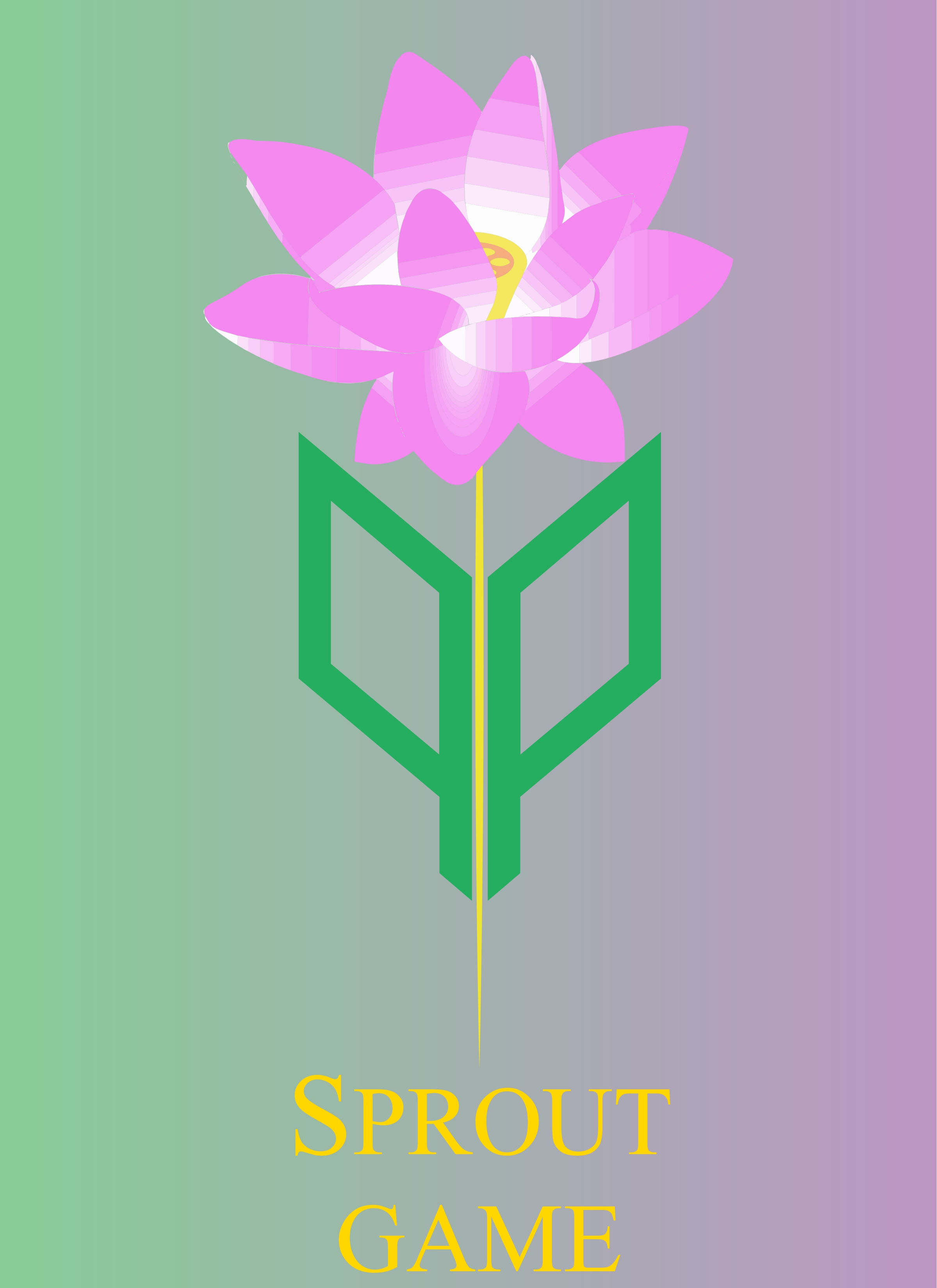
Today, I stand here full of gratitude to share with you the journey of designing our game’s logo. From the very moment I picked up my tools and began to sketch, I felt an urgent desire: not to drift with the current, not to be bound by tradition. I understood deeply that a great logo must go beyond the spontaneity of a hand-drawing; it must be rendered as precise, rigorous vector art—no matter how intricate the design, every line must be exact and clean, like Canada’s coat of arms: complex yet clear, exuding calm and strength. This semester, in my typography and illustration classes, I absorbed countless new insights. Those courses not only gave me a solid foundation in design, but also taught me that only with clear understanding and a firm concept can the path of design truly widen. In class I learned of artistic principles that seem contradictory yet are internally unified—both simple and complex, both classical and modern. Contradictions abound in real life, but in design these seemingly opposing elements can coexist in harmony and enhance one another. That unity in tension is my constant guiding principle and my ultimate goal. I firmly believe that inspiration should not come from chaotic imitation. Juvenile, careless copying only reduces design to mediocre repetition. I recall how in childhood our creativity was pure and sharp, then gradually worn down by time and outside distractions. We must learn to break free from ingrained ways of thinking and remove the shackles that stifle innovation. As Camus said, “The greatest error of mankind is to give things a meaning when they in themselves have none.” That reflection on meaning taught me that setting a fixed standard is in itself absurd. Our game is called “Bud,” so everyone naturally expected my logo to mimic the bud’s shape exactly—but I knew the essence of design lies not in copying but in transcending, just as a bud inevitably transforms into a blossom. That is why, after I completed my first logo, it met widespread opposition. I went on to refine it through five more versions, incorporating every suggestion and critique from the team. Yet no matter what I tried, it was rejected and taken down—so I created an entirely new version to replace it. But through my repeated arguments and explanations, today my original logo has returned. Designing a logo is not simply about stacking rules; it is a challenge to definitions. If you design a logo for a tech phone company by blindly following existing patterns, everyone’s design will end up looking like a rectangular phone. But Steve Jobs used an apple and overturned conventional expectations. Twenty years ago, the concept of a smartphone didn’t even exist—so how would you design it? Likewise with Tesla: if everyone based their designs on traditional cars, there would be no electric revolution. Elon Musk dared to eliminate complex buttons, reduce everything to a simple screen, and even created the sharply futuristic Cybertruck. It is this boundless pursuit of innovation that propels the world forward and makes every seemingly meaningless moment spark with the power to change the future. Today, my logo too has undergone that transformation from bud to full bloom. It is more than just an image—it has returned at last, carrying all my persistence and passion, quietly telling its own story.
Watch Our Trailer
“From tender green the petals rise,
A game of light beneath pink skies;
In every bloom your spirit plays—
A sprout that grows in endless ways.”
Leave a Comment